
Marketing is often mistaken for a purely creative pursuit, but the truth is this: the world’s most memorable ads are built on psychology. Every poster, hoarding, or digital banner that catches your attention does so because it appeals to how the human mind and eye naturally behave.
Today, let’s explore 8 powerful, proven marketing psychology hacks—from eye-movement patterns like the Z and F shapes to billboard angles, color psychology, pricing illusions, and more.
These aren’t theories. These are timeless principles used by the biggest brands on the planet.
The Z-Pattern: The Invisible Highway Your Eyes Travel
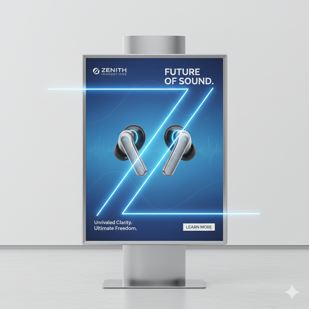
Whenever you look at a poster or webpage, your eyes instinctively follow a Z-shaped path:
Top-left → Top-right → Bottom-left → Bottom-right.
Advertisers use this predictable eye journey to place the most critical elements where your brain will travel naturally:
- The logo or headline sits at the top-left.
- The main image or message holds the center diagonal.
- The CTA (Call to Action)—“Buy Now”, “Visit Today”—rests at the bottom-right.
Brands like Coca-Cola and Pepsi have used this for decades. Their posters look “clean”, but they’re actually precisely engineered along this invisible Z-channel.
The F-Pattern: When Scanning Turns into Skimming

While the Z-pattern rules posters, the F-pattern rules digital screens—websites, blogs, landing pages, and mobile apps.
Users reading online don’t move diagonally. They skim in the shape of an F:
- First horizontal scan (headline).
- Second horizontal scan (sub-head or highlights).
- Then a vertical downward skim on the left side.
This is why:
- News websites place headlines at the top-left.
- E-commerce platforms arrange categories on the left sidebar.
- Landing pages place benefits and CTAs aligned along the left column.
If your webpage hides key information in the bottom-right corner, most users will never see it.
The Hoarding Angle Rule: Tilt It Right, Make It Shine
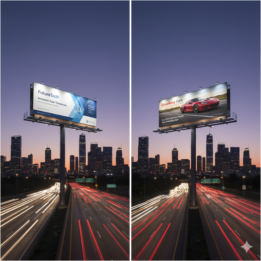
Outdoor hoardings (billboards) perform best when tilted at 30–45 degrees to oncoming traffic.
Why?
Because at this angle, the ad stays in the driver’s line of sight longer, increasing recall by nearly 70%.
Think of the hoardings placed near curves, traffic signals, or highway turns—they’re never flat. They lean into the driver’s eye path, making sure you can't ignore them.
If your hoarding sits perfectly perpendicular to the road, it gets only a half-second glance.
At the right angle? It gets three to five seconds. That’s everything in advertising.
The Colour Code: Painting Emotions That Sell
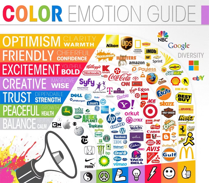
Colours speak faster than words. Way faster.
Each colour triggers a specific emotional response:
- Red → urgency, excitement, hunger
- Blue → trust, calm, professionalism
- Yellow → energy, optimism, instant visibility
- Black + Gold → luxury, exclusivity, premium positioning
McDonald’s uses Red + Yellow—one stimulates hunger, the other grabs attention.
Luxury brands like Rolex use Black + Gold to whisper sophistication.
Choosing the right colour palette isn’t about beauty—it’s about influencing the subconscious. You can read more about it from my post https://www.srinath.co.in/colour-psychology/
The Power of Gaze: Let the Eyes Lead the Buyer
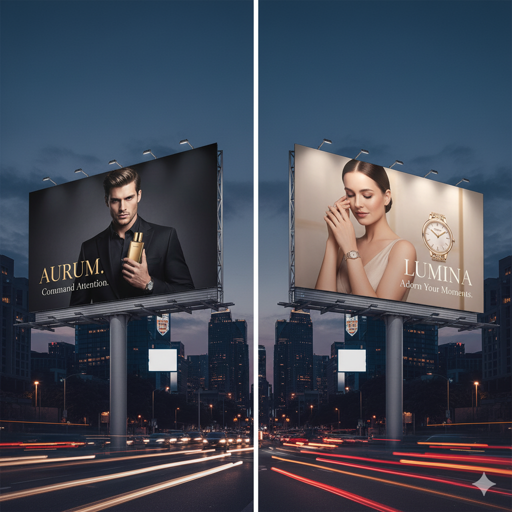
Humans instinctively follow gaze direction.
If an ad features a person:
- Looking directly at you → creates emotional bonding
- Looking at the product → forces your eyes to follow theirs
This is why baby-product ads show infants looking lovingly into the camera, while food ads show the model gazing at the burger or pizza.
Your eyes mimic the model’s eyes—and your attention goes exactly where the advertiser wants.
Fitts’s Law: Make It Big, Make It Easy

Fitts’s Law states that the bigger and closer an element is, the easier it is to notice and interact with.
Marketers use this everywhere:
- On hoardings: giant “50% OFF” text
- On websites: huge CTA buttons close to the thumb zone
- On packaging: oversized “NEW” or “ZERO SUGAR” badges
Netflix’s big red “Play” button or Domino’s gigantic “30 Min Delivery” text are perfect examples.
Your brain processes larger objects faster—and remembers them longer.
The 3-Second Rule: Hook Before They Blink
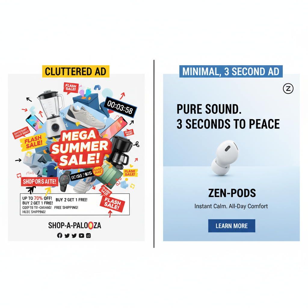
You have three seconds to capture attention.
Not five.
Not ten.
Just three.
Whether it’s:
- a hoarding on a highway
- a social media ad
- a website landing page
… people decide instantly whether to stay or ignore.
The 3-second formula:
- One bold headline (under 7 words)
- One strong visual (face or product)
- One clear CTA
Apple’s ads follow this religiously—simple product shot, two words, and the iconic logo.
Zomato’s quirky hoardings also thrive because they’re easy to read in a second.
The Odd-Number Effect: The Beauty of Imperfect Memory

Human brains remember odd numbers better than even ones.
Lists with 3, 5, 7, 9, 21 stick longer because they feel slightly “imperfect”—and that imperfection grabs attention.
Ever noticed how:
- BuzzFeed uses “23 Reasons You Should…”
- Marketers use “Buy 3 Get 1 Free” instead of “Buy 4”
- Prices end with .99 (₹999 feels cheaper than ₹1000)
This is the left-digit bias—our brain sees “9” first and perceives the price as lower.
Odd numbers create curiosity.
They feel real, authentic, human—not staged or rounded.
Final Thoughts
Marketing isn’t guesswork.
It’s design + psychology + timing.
Understanding these patterns—the Z-pattern, the F-pattern, the perfect hoarding angle, the right colors, the power of gaze, Fitts’s law, the 3-second rule, and even the magic of odd numbers—gives you the power to create ads that don’t just look good…
they work.
The next time you create a poster, design a webpage, or plan a billboard, ask yourself:
Is this aligned with how the human brain actually behaves?
Because the brands that master psychology are the ones people remember.